The Problem
The legacy Survey Builder at Discuss was a victim of its own success—years of "bolted-on" features on a jQuery codebase created a steep learning curve and massive support overhead.
This project didn't start with a brief; it started with an investigation.
While analyzing company-wide friction points, I discovered that 52.1% of all support tickets (over 1,100 annually) were rooted in a single, aging jQuery-based Survey Builder. Further Pendo analysis revealed that power users were spending 9,000 minutes daily fighting with this interface.
Identifying this massive operational cost allowed me to build the business case for a ground-up 0→1 rebuild. I led the transition from a fragile legacy tool to a scalable React experience, acting as both the strategic lead and the UX Engineer behind the functional prototype.
The Approach
The approach was entirely research-driven before any solution was defined. Multiple parallel lines of inquiry ran before touching design:
Competitive Benchmark
8 platforms analyzed (SurveyMonkey, Typeform, Qualtrics, and direct competitors) to map capability gaps and identify interaction patterns users already knew.
Behavioral Data
30 days of data revealed ~140 accounts spending ~9,000 min/day inside the tool, multiplying every friction point across hundreds of daily sessions.
Support Ticket Mining
2,195 tickets from the last 12 months, with 1,144 (52.1%) directly related to survey design and logic.
Internal Expert Interview
Structured validation of proposed solutions before building, resulting in one rejected direction (smart filtering) and two design risks addressed upfront.
The Solution
The Survey Builder was rebuilt from the ground up using React 19, focusing on a highly interactive, state-driven architecture that allows for real-time feedback and complex user interactions without the overhead of legacy jQuery. The solution was built in close collaboration with engineering, using AI-assisted development workflows to validate architecture decisions and compress delivery — ensuring the POC served as a technical source of truth, not just a design artifact.
I completely reimagined the survey creation experience, focusing on discoverability, context visibility, and frictionless workflows.
Engineering Collaboration
Throughout the process, I collaborated closely with the engineering team to validate technical feasibility — including the React 19 architecture decision, the drag-and-drop strategy via react-dnd, the state model separation between UI state and survey business rules, and the component boundaries that would need to hold at design system scale. The POC was built not as a handoff artifact, but as a shared proof of technical and design direction, ensuring engineering alignment before any production commitment.
AI-Assisted Development
AI-assisted workflows using Claude and MCP-based tooling were structured as a pipeline: survey context and component conventions were fed into the model as structured input, outputs were validated against the design system's token and component rules before being applied, and accepted artifacts fed directly into the Storybook documentation layer. This pipeline — AI integrated into the system's own governance, not just used as a shortcut — compressed a complex implementation into a focused 2-week cycle and directly informed the AI-native workflows built into the Foresight Design System.
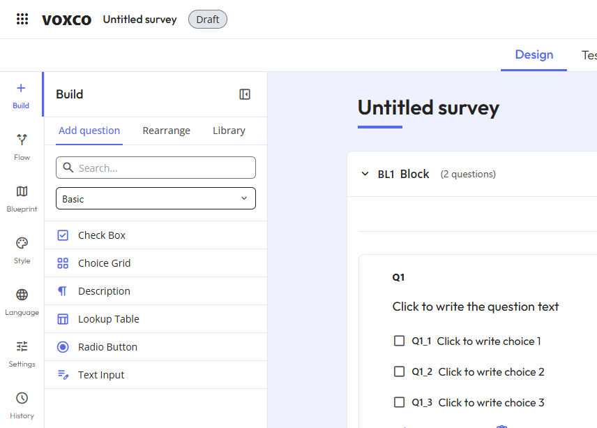
Re-architecting the Question Toolbox
The legacy toolbox was a flat, ungrouped list that was impossible to scan. I redesigned it for discoverability with categorized grouping to reduce cognitive load, instant search for power users to find question types in milliseconds, and an inline selector to switch question types directly on the canvas without deleting and recreating content.
const [{ isDragging }, drag] = useDrag({
  type: 'TOOLBOX_ITEM',
  item: { id, type, icon },
  collect: (monitor) => ({
    isDragging: !!monitor.isDragging(),
  }),
});

return (
  <div ref={drag} style={{ opacity: isDragging ? 0.5 : 1 }}>
    <Icon name={icon} />
    <span>{type}</span>
  </div>
);
The ToolboxItem component enables users to add new questions to the survey via drag-and-drop. It leverages the react-dnd library's useDrag hook, accepting id, type, and icon as props. The component provides real-time visual feedback by monitoring the isDragging state to adjust its opacity during the interaction.
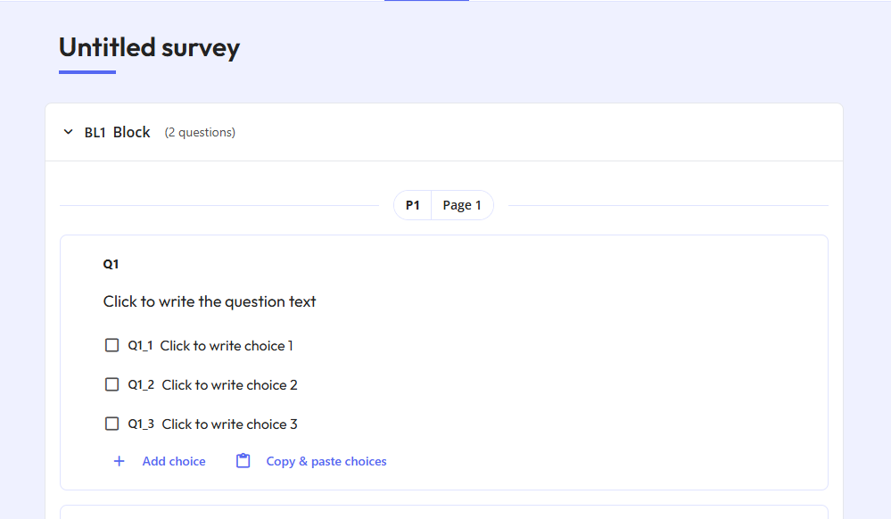
Eliminating the "Context-Switching" Tax
I redesigned the edit view to be visually faithful to the final respondent experience with a WYSIWYG canvas so users no longer need to hit "Preview". I also added an inline mobile preview in the sidebar to close the feedback loop for responsive design, and a persistent outline sidebar for navigating long surveys with block-level actions without endless scrolling.
const renderContent = () => {
  switch (question.type) {
    case 'text':
      return <TextInput value={question.content} onChange={handleUpdate} />;
    case 'choice':
      return <ChoiceInput options={question.options} onChange={handleUpdate} />;
    default:
      return <DefaultInput />;
  }
};

return (
  <div className="bg-card p-6 rounded-lg shadow-sm border border-border">
    {renderContent()}
    <button onClick={() => onDelete(question.id)} className="text-destructive">
      Delete
    </button>
  </div>
);
The QuestionCard is a dynamic container that handles the rendering of various question types. It manages state updates and deletions through callback functions passed from the parent canvas. Built with Tailwind CSS, it maintains a modern card UI while delegating specific rendering logic to sub-components based on the question.type property.
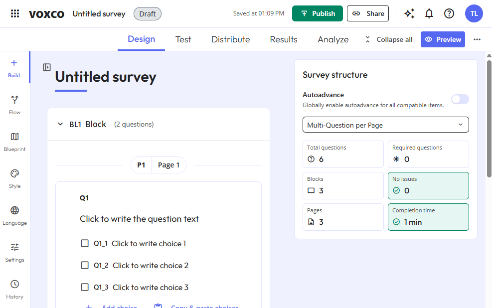
Visibility, Speed & Safety
I surfaced a permanent status indicator in the top bar so users can instantly monitor if a survey is active without extra navigation. I replaced click-based controls with fluid drag-and-drop reordering and bulk option pasting, and implemented autosave with confirmation guardrails for destructive actions. All components — QuestionCard, ToolboxItem, the outline sidebar, and the drag-and-drop canvas — were built with system-readiness in mind from the start: semantic color tokens, documented interaction states, and Tailwind-based styling consumable by both Figma and Storybook. These weren't one-off components. They became the first production stress-test of what later became the Foresight Design System — proving that the token architecture and component conventions held under real enterprise complexity before the system was formally established.
Outcomes
Usability testing confirmed that the redesigned canvas significantly reduced task completion time. Users completed core survey creation workflows without assistance on their first attempt, describing the experience as more intuitive and predictable than the legacy tool. The persistent status indicator and autosave guardrails were cited as immediate trust signals, with the solution expected to reduce logic and survey design support tickets from 52.1% (1,144/year) to ≤30% through robust confirmation guardrails and improved status visibility.
≤30%
Target for logic support tickets
-40 min
Estimated time saved per session
Targets derived from usability testing and support ticket analysis; time savings estimated from Pendo behavioral session data (~9,000 min/day across ~140 accounts).
Senior Learning
This project was great because I learned how to build a real, production-grade React application from scratch. I learned how to manage complex state across multiple interconnected features, how to implement conditional survey logic (skip, display, branching), how to integrate an AI assistant directly into a product workflow, and how to think about a UI tool that designers and researchers actually use — not just a prototype.
But as the project grew, I identified that problems started to emerge because I wasn't yet clear on the difference between business rules ("what the software must do") and technology layers ("how the software does it"). Without that distinction guiding my decisions, business logic slowly leaked into the wrong places — rules about how surveys work ended up mixed inside visual components and state hooks instead of living in a protected, independent core.
I also didn't have clear module boundaries from the start. Features like the question editor, skip logic, preview, and AI assistant grew organically into the same shared folders, making it increasingly hard to change one area without risking unintended effects in another.
Next Steps
The natural next step is to work on two parallel initiatives that directly address what I learned.
Documentation first. Because I now understand that the Survey Builder has unique, domain-specific components that don't exist in any generic design system, the priority is to document them in Storybook — capturing every visual state, variant, and behavior of components like QuestionCard, SurveyBlock, LogicDisplays, DiagramCanvas, and the GeminiPanel. This process itself will expose where components are too tightly coupled, making the architectural problems visible and concrete rather than abstract.
Then, architecture refactoring. Armed with that visibility, the goal is to make three structural corrections: break apart the oversized App.tsx and useSurveyActions.ts files that accumulated business rules they shouldn't own, move those rules back to the protected business core already established by logicValidator.ts and types.ts, and reorganize the components/ folder into clearly bounded feature modules — one per business domain — so the codebase can grow without features bleeding into each other.
The documentation and the refactoring are not separate tasks. The Storybook process will reveal exactly what needs to be fixed, and the architecture fixes will make the final documentation clean and trustworthy. One feeds the other. This work is already underway within the Foresight Design System — where the Storybook infrastructure, AI skills, and MCP integrations are in place and waiting for these domain-specific components to be documented into the system.